Manaus Bar – A visual identity that travels
The Challenge
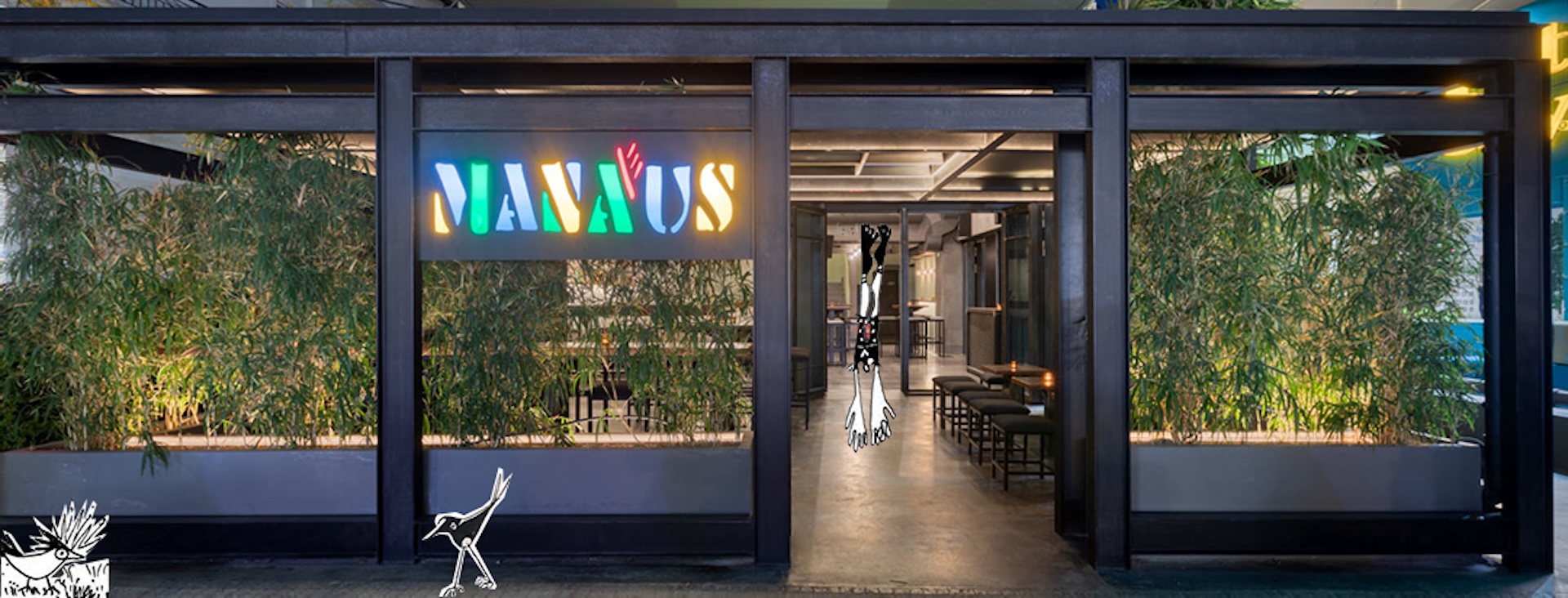
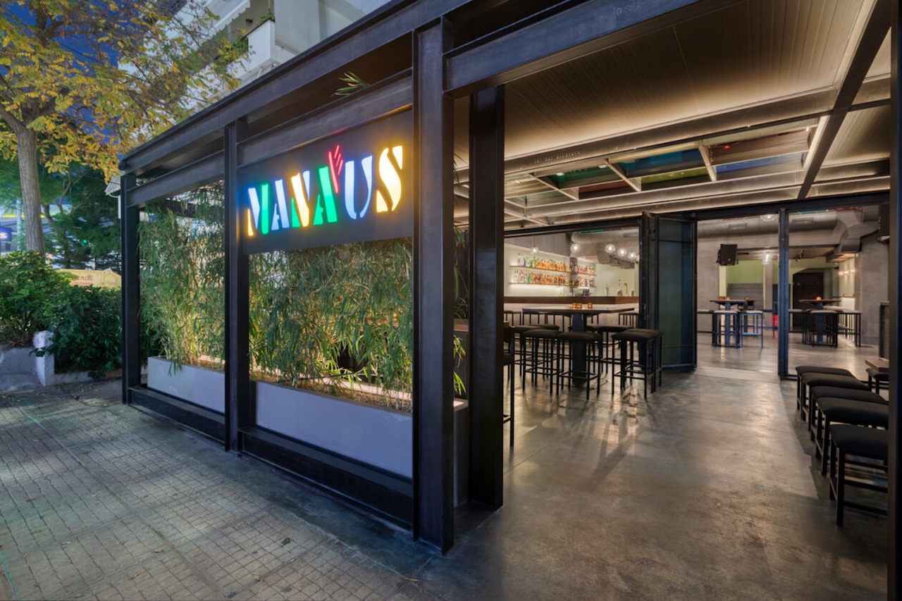
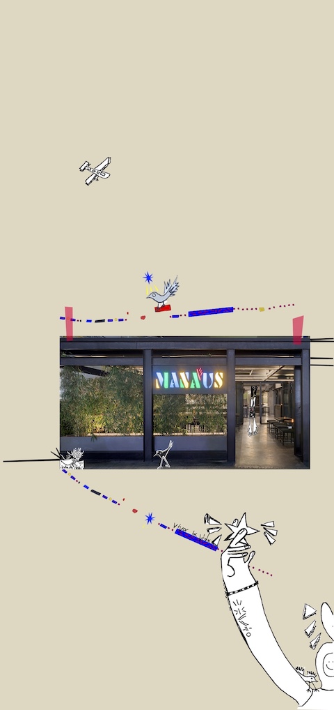
Manaus is a city hidden deep in the Amazon rainforest — a place of contrasts, vibrant colors, and a unique architectural past. When two brothers decided to return to their childhood neighborhood of Glyfada and create a space inspired by their years living in Brazil and Italy, Manaus Bar was born.
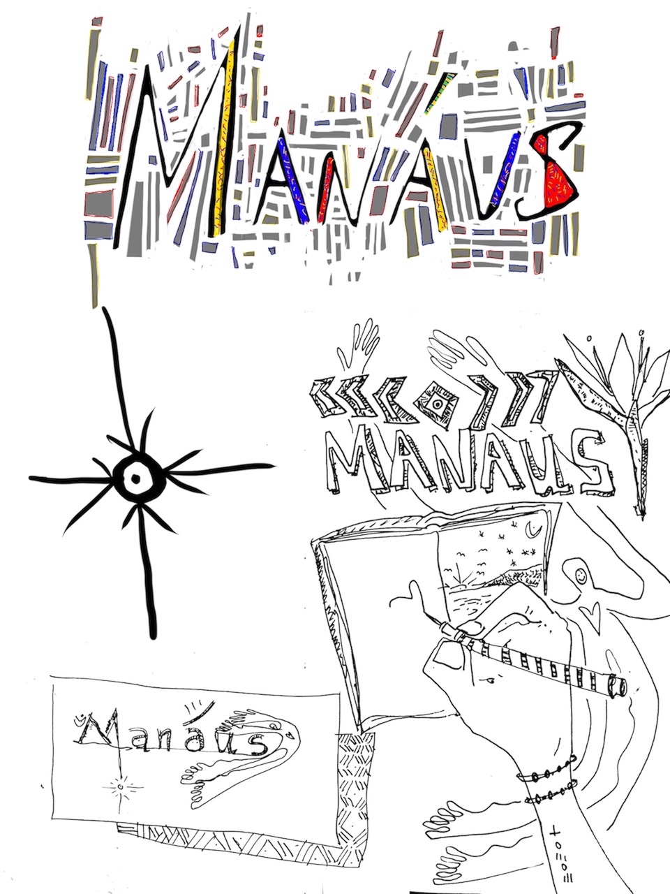
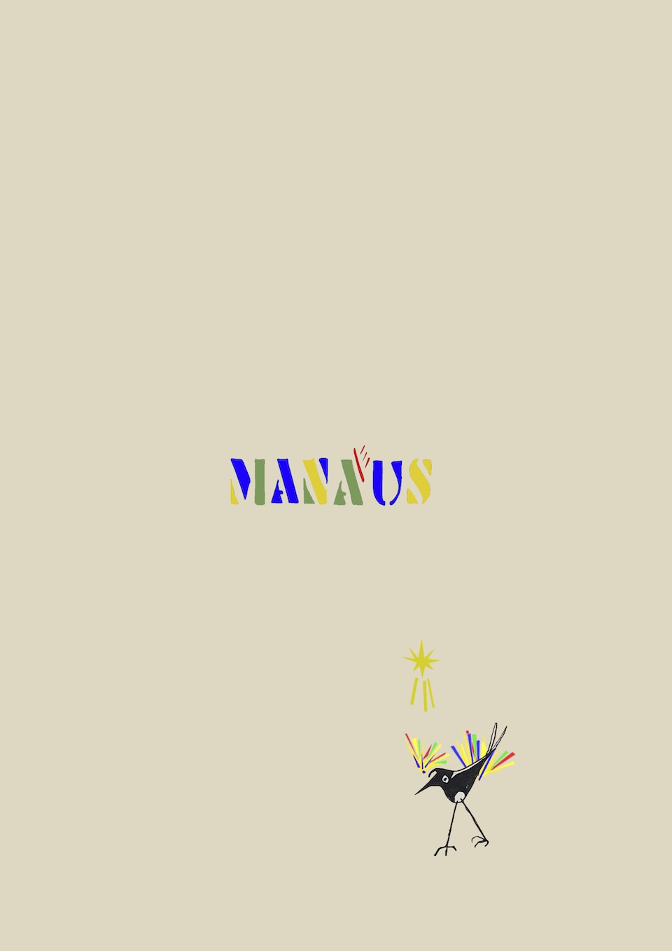
My mission was to design its visual identity. To capture a sense of the exotic, the multicultural, and the deeply personal — through the creation of the logo, menus, and business cards.
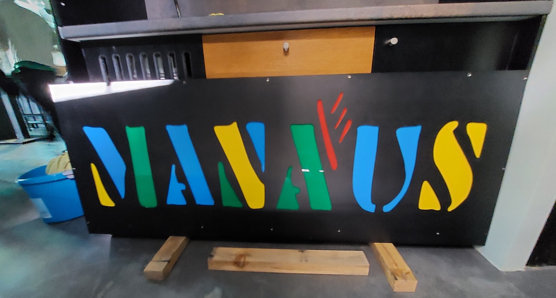
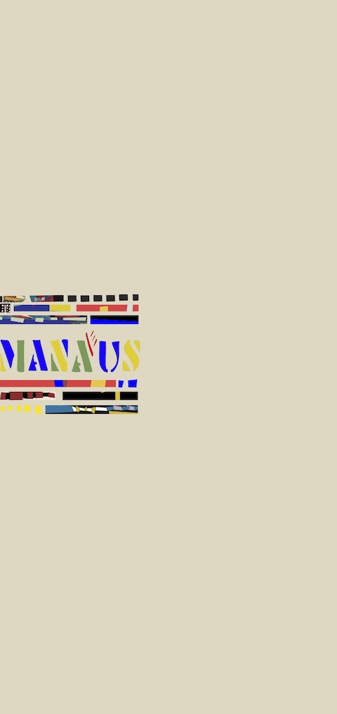
The Inspiration of the logo
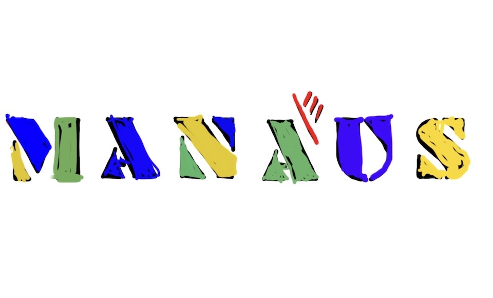
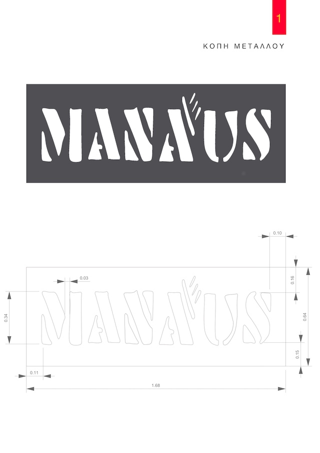
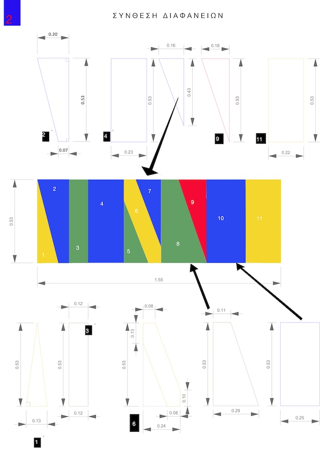
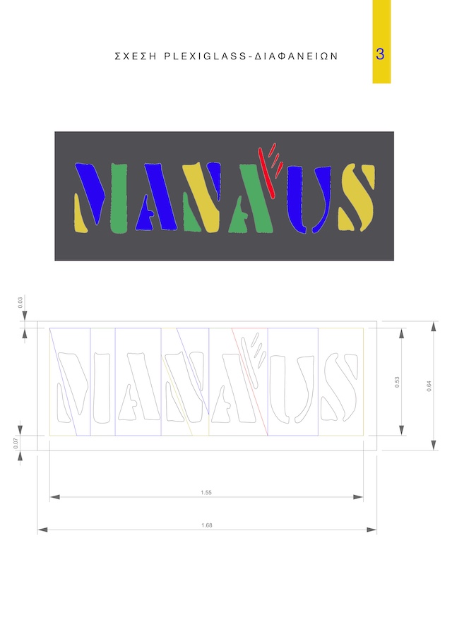
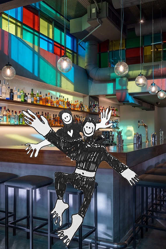
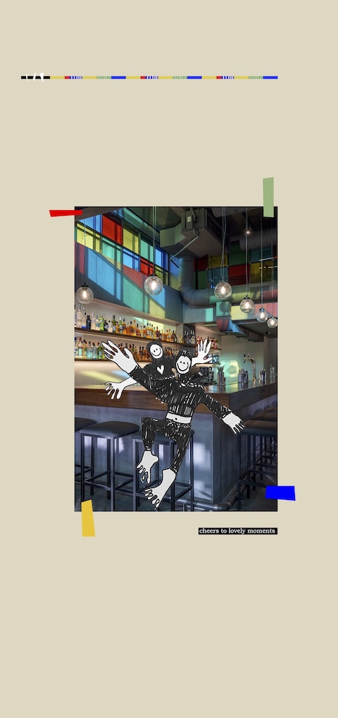
The design direction was guided by the character of the city itself: the raw textures of concrete and steel found in Brazilian modernism, the vivid tones of stained glass, and the constant transformation of light and shadow within the jungle. The logo draws on strong geometric lines, while the color palette reflects the shifting light of the Amazon — much like the natural lighting inside the bar, which changes throughout the day as it passes through the stained-glass windows.
The Design
The menus were created in folded formats (bi-fold and tri-fold), with clean typographic structure and a balanced layout. Each drinks category has its own space to breathe, presenting the bar’s wide selection with clarity and elegance.
The Business Card
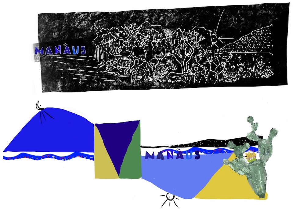
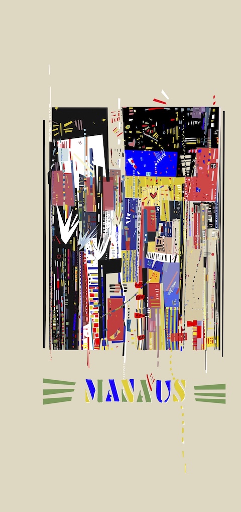
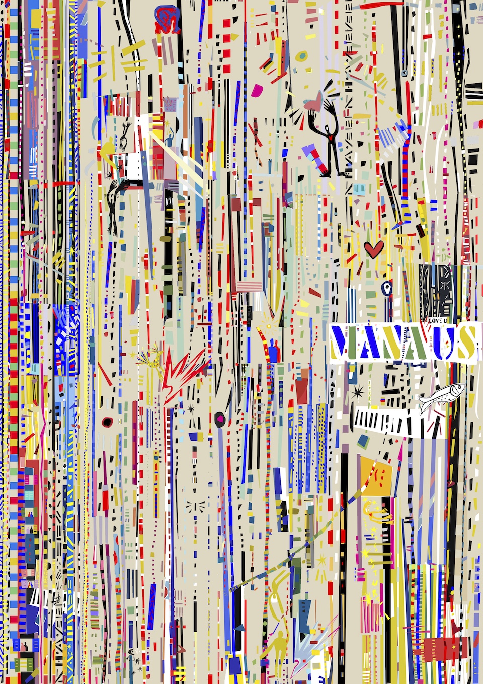
The business card measures 5×8 cm and holds a special emotional value. Its design is based on a favorite painting of the two brothers — a piece that I digitally reinterpreted, adding my own visual touch while aligning it with the overall aesthetic of the brand.
The card comes in two versions: one in Greek and one in English, using reversed color schemes to create a subtle yet refined visual contrast. A small piece of art in itself, the card doesn’t just convey contact details — it tells part of the Manaus story.
The Outcome
Manaus Bar is more than a venue. It is an experience — a journey into light, music, and culture. And for me, it was a creative opportunity to translate that journey into color, form, and paper. A visual identity that doesn’t just communicate, but truly travels.
** Part of an architectural project of Eleftherios Ambatzis, as presented on Archello
©2025 Natalia Kesente